ELM by MATTHILDUR — An Elegantly Logical Approach to Style

9 Oct

When I was first introduced to the ELM collection I was completely intrigued by how easy it was to work with.  Nothing was necessarily ‘dressy’ or ‘casual’ — pieces could be mixed in a million ways – fabrics, colors, textures, patterns all worked off of each other enabling to wearer to, with a minimum of pieces, create an entire wardrobe.  I felt as if I could close my eyes, pull a handful of pieces a hundred times over, and always come up with something unique, wearable and elegantly easy.

Six years later, I’m still intrigued.

Founded in Reykjavík, Iceland and currently based in Lima, Peru – both urban cities surrounded by unbroken, idyllic nature — it’s easy to understand how ELM and its creative director, Matthildur, so heavily influenced by her surroundings, can so easily manipulate the purest natural cottons and the most cutting-edge microfibers.

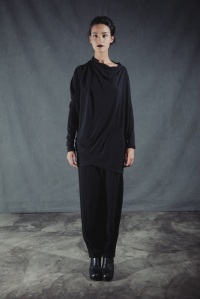
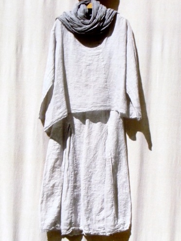
ELM FW SHOT 1

Brushed Wool Cardigan-Jacket & Skirt with Stretch Jersey Top
Autumn/Winter 2013

Plays on proportion and texture abound each season – nothing is ‘dressy’ or ‘casual’ – and pieces are sculptural and fluid, architectural and dramatic or wonderfully basic and easy.  These are pieces for, in ELM’s words, “intellectual women of all ages who like to dress in a sophisticated manner, albeit with an edge.”

Logic and fashion are words rarely used together in the same sentence, but ELM’s collection is easily the most logically elegant approach to fashion I have ever worked with.  Every season manages  (in a way that leaves me scratching my head)  to work with the same core of exceptional textiles – Japanese microfiber, Peruvian wool and Pima cotton, Spanish linen and silk, and stretch jerseys in wool, modal and cotton mixes  – to make fresh, unique and wonderful pieces each season that are at once timeless and of the moment.

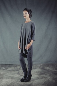
ELM FW SHOT 3

Asymmetric Stretch Wool Jersey Tunic & Trouser
Autumn/Winter 2013

These hallmark fabrics in every ELM collection allows for a systematic approach to dressing where you can, quite literally, pull a five-year-old piece from your closet and match it with a brand new arrival.  Add to that the fact that many of their pieces can be adjusted or worn more than one way and you have a line of wardrobe staples that simply never feel stale.

ELM’s intrepid garments are also a wanderer’s wish come true.   Their microfibers and jerseys are weightless and pack like a dream.  Their taffeta separates go from day to evening, are nearly impossible to wrinkle and can be hand-washed.  It’s not at all unusual for a client to remark on the ‘new life’ her past-season ELM pieces receive with every season’s new arrivals.

ELM FW SHOT 5

Lightweight Microfiber Tunic & Trouser
Autumn/Winter 2013

It’s no secret that I believe in dressing with intent and creativity, but there should always be a certain logic (yes, that word again) in what you purchase every season.  In such a frenetic economy the idea of investing in something that will end up being ‘so last season’ in a few short months seems utterly frivolous, and that’s what makes ELM so fantastic.  To me the collection embodies the spirit of a wizened, energetic traveler – these are pieces for a woman who thinks, works, reads, actually eats, and lives her life well and fully.

I hope you can find time to stop in and view the new Autumn/Winter collection.  In the meantime, take a moment to view ELM’s Autumn/Winter 2013-14 collection video by clicking here  – it’s beautiful.

Thanks for reading and all your support.

Be well,

Christopher


THE HYPNOTIC HERKIMER

11 Jul

herkimer byzantine detail

For almost a year now I’ve had the pleasure of working with Tracey Chareas, owner of The Ruby Door and creator of most of the amazing jewelry in the store. She and I share a passion for stones, both precious and semi-precious.

A recent series of pieces that Tracey has done focuses on what are known as Herkimer diamonds, and they are amazing.

herkimer double point crystal

Pure Herkimer Quartz Crystals
( Note the Double Terminations )

Herkimer diamonds are not, in the molecular sense, diamonds at all. They are a particular and rare type of crystal quartz that has points, or prisms, on both ends. The scientific term for a crystal’s prism point is its ‘termination’. While the overwhelming majority of quartz crystals have only a single termination, Herkimer crystals possess a double termination. In other words, both ends of the crystal finish in points, which allows for light to refract and reflect within the crystal far more brightly.  Interestingly, it is still not known with certainty what causes this rare type of formation to occur.

herkimer cluster 145

Classic Small Clear Herkimer Diamond Cluster
on 14k Gold Chain
by Tracey Chareas Designs

These crystals were originally discovered in Herkimer, New York in the late 18th century. Herkimer crystals come in a variety of shapes and colors – from small, clear examples to larger, more opaque versions. These larger crystals are my personal favorite. They either look crisp and icy or have subtle, smoky occlusions that lend an air of age to them — as if they were recently unearthed in some archaeological dig. (And, for all practical purposes, they were.)

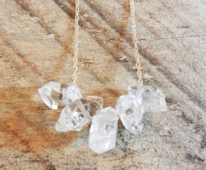
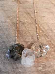
herkimer 3 on rose chain

Three Large Herkimer Diamonds
of Varying Clarity on 14k Rose Gold Chain
by Tracey Chareas Designs

Quartz in general carries some very interesting properties, and it’s no coincidence that crystals have been used for centuries as a healing aid. When electrified, the molecular lattice structure of a common, single-terminated quartz crystal can actually transmit electricity – albeit only in one direction. Those who are inclined to work with crystals for healing often use Herkimer quartz crystals because, unlike their more common single-prismed counterparts, the double termination of a Herkimer diamond can transmit energy both ways. Consequently they are often popular as jewelry not only for their shine and sparkle, but for their deeper energy-transmitting properties.

Most Herkimer crystals are now mined in Australia and other countries, but they can still be found in the Herkimer region of New York State. Specimens from this region are highly prized and collectible for their extreme clarity and sparkle.

Often accented by antique components or handcrafted metal work, when Tracey puts her hand to them the results range from minimal and organic to positively Byzantine.

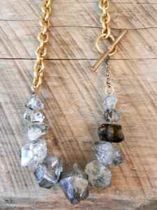
Herkimer Diamond and Vintage Chain 2

Clear & Smoky Herkimer Diamond Necklace
on Hand-Knotted Silk with Vintage Chain
by Tracey Chareas Designs

Matched with a vintage brass watch chain, these Herkimer diamonds at right range in size and color with a rich, multi-hued patina.

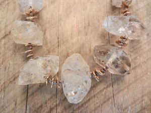
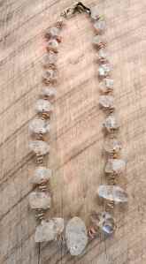
Below, an amazing necklace composed of gradated medium to very large frosty white and clear Herkimer diamonds with handmade brass chips.

herkimer byzantine full

Graduated Herkimer Diamond & Brass Chip
Necklace on Hand-Knotted Silk
by Tracey Chareas Designs

All pieces by Tracey Chareas are limited edition or one-of-a-kind.  For more information, to inquire about a specific piece or a custom order, call 617.720.2001 or email tracey@therubydoor.com.

Thanks for all your support.

Be well,

Christopher

MANUELLE GUIBAL — The Visions of an Artisan

13 Jun

The very first piece I sold in my store was a Manuelle Guibal jacket.  It surprised me then – it doesn’t now.

MG LOGO

I first encountered the Manuelle Guibal collection on an unusually warm day in early March of last year.   I was in New York scouting out my Fall buys and had already established who I was working with vendor-wise.  I had some time to kill and decided to walk through the Chelsea Art Museum, which for the purposes of fashion week in NYC had been converted into stalls for various vendors to show their wares.

As I turned a corner my eye was immediately drawn to this beautiful Japanese woman walking towards me, quietly conversing with her colleague.  She wore a sleek black turtleneck that made the complexity and volume of the black skirt she was wearing that much more intriguing.  It was a piece that was at once simple and complicated, wrapping over itself in a soft cocoon.  She had black boots on and the only thing out of place was a strand or two of her long dark hair, and somehow even that seemed intentional.

I loved the mix of tight and loose that she was wearing, but what intrigued me most about her was that, unlike most of the people surrounding her in this hot and crowded arena, she looked untroubled and approachable.  To me she was the embodiment of what style is about – being comfortable not only in your own skin but in the clothing you choose to envelop it in.

As she walked past me I thought “This is the kind of person I admire.  This is the kind of style I want to be able to express in my space.  Not something about the latest trend or something to show off your amazing cleavage, but something that makes you stop, dead in your tracks, and think ‘now there goes someone who gets it.’ “

A few minutes later I entered an aisle and came upon a large booth, hung with garments in deep, rich hues and textures.  At the center of the racks stood a simple dress form wearing almost exactly the same skirt as the lovely woman I had just passed.  I approached it with tentative excitement.   It was made in a black stretch wool gabardine that moved like water over my hand.  I always buy with my fingers as much as I do with my eyes, so naturally I fell in love.  I browsed the racks, taking a mental note of this item and that, all the while remembering that I really hadn’t planned to pick up another line.  I took a card, nodded my thanks to one of the women there and continued to my next appointment.

I could not keep the line out of my head for the rest of the day.

The next morning I made a beeline back to the booth, and introduced myself to the line’s creator, Manuelle Guibal.  Between my rather poor French and her far better English we managed to strike up a conversation.

guibal herself

The designer herself

I learned very quickly the passion she had for her craft – her eyes danced as she told me of the time and difficulty she has with getting just the right tone and shape to each of her pieces, of the small factory in the French countryside that produces the majority of her knits and her close working relationship with them.  It was obvious to me that, even though it was a great trouble to create what she did, she couldn’t imagine doing anything else, and in that I found a kindred spirit.

Manuelle’s admirable work ethic manages to produce garments unlike anything I’ve ever come across.  The Spring/Summer 2013 collection is done almost entirely in knit cotton, cotton poplin and crushed linen.  Of course all wonderful garments start with equally wonderful textiles — but her focus on them, their properties and variations — this was something I rarely came upon.

Each piece is individually garment dyed for a very unique depth of color and texture.  Guibal’s washed and crushed linens are richly toned and imbued with a sense of age, as if you’re wearing a piece that was buried for millennia and just recently unearthed.  They just slip on, softly skimming over the body, and the more wrinkled they get the better they look – and feel.

MG LINEN 1

A crushed linen ensemble for SS2013

Her cottons are unbelievable.  This is not your typical ‘Hanes t-shirt’ cotton.  This is serious cotton involving high-twist yarns carefully blended with just a touch of Lycra, hand-guided on a custom loom, then individually dyed with a rolled raw-edged hem.  This is cotton knit to be soft as silk and light as air but made to wear like iron.  Add to that crisp stretch poplin pieces that rustle like sailcloth, snapping taught and breaking free around you as you move.  Insane.

guibal ss coton pic

A stretch knit cotton ensemble – SS2013

There’s a certain sense of peace that comes with wearing clothing like this.  I don’t know if it’s because there is so much integrity behind each piece, that it’s created by someone who loves their métier, or craft, as Manuelle does.  It’s cerebral style – there’s no other way to put it.  These are pieces that you’ll have forever, investment pieces with no sense of season or trend.  And it’s wonderful how systematic her pieces are – 5 pieces make 20 looks, and it’s all up to the wearer to be as classic or creative as they like, to mix them with other favorite garments and to, as always, dress with intent.

I hope you all can visit soon and see the collection for itself — it’s a treat.

Thanks for your following and support….

x

Christopher

Japan — An Ascetic Aesthetic

27 May

“Everyone has a body.  It is the spiritual you keep secret, the things of the mind.”

 — Makiko Minagawa, Textile Designer

There is an elegance, a sense of nobility attributed to Japanese culture that I have always found fascinating.  Japan is a unique synthesis of the old and the new – a country that, while at the forefront of technology continues a reverence for ancient tradition that pervades every aspect of society.

My first introduction to Japan was in the early 1980s, when Yohji Yamamoto and Rei Kawakubo for Comme des Garcons, along with Issey Miyake, shocked the fashion cognoscenti with their first Paris runway presentations.  Kawakubo’s

Comme des Garcons

shredded edges and Yamamoto’s somber layers were initially dismissed as ‘bag lady chic’ by critics and editors alike.  But they gained a rapid and loyal following with artists, architects and those working in creative fields, and were soon heralded as visionaries presenting a truly new approach to design.

The world’s fascination with these designers lay in their unique approach to clothing – in an era that heralded conspicuous consumption and blatant displays of wealth, these three individuals were presenting garments that were the antithesis of ostentatious European high fashion.  Soft, ragged layers, inky hues, intentional holes and exposed seams – these were not the clothes of a Wall Street kingpin or the ‘ladies who lunched’.  These were garments for intellectuals and poets, artists and scholars.  These were garments that challenged the wearer to think – a concept heretofore unheard of in the presentation of fashion.

Yohji Yamamoto

It was this shocking yet understated approach – lacking in overt sexuality and brazen showiness – that came to be the quintessence of Japanese fashion.  Yet at the time, Japan and its people were still shrouded in mystery.   As the 1980s continued these designers and their unique vision began to infuse all aspects of design.  The world turned its attention to what had been, since the end of World War II, an insular (and consequently fascinating) society – for many Japan had become the ‘undiscovered country’ where all things newly creative sprang.  Only then were the unexpected parallels between Japan’s most cutting-edge creators and the millennia-old artistic ideals of Japanese culture revealed.

Issey Miyake

There is a notion of modesty and subtlety, a respect for ceremony and procedure, an approach to duty and honor – that is unique to Japan.  To the western eye these values are construed as anything from hopelessly anachronistic to downright obsessive – yet they contribute to a reverence for aesthetics that is utterly unique and exquisitely complex.

This distinctive approach to all that appeals to the senses has, over centuries, imbued the Japanese with a veritable omnibus of terms that define everything from the simplest idea of placement (shibui: austerity of taste – not concealing the true nature of an object – a vase is a vase, a toaster is a toaster…) to the most esoteric concepts of shaping space (aji: where the incongruity of the object speaks of the congruity of the whole – the idea of sleeves filled with nothing, of space filled only with color…)

Entire volumes have been written about these concepts, with books devoted quite literally to one basic notion.  It is impossible to dissect and document the whole of Japanese visual culture, but there are two concepts in particular that everyone can understand, appreciate and apply on some level to aspects of their own surroundings:

WABI SABI:

This is an amalgam of two separate but similar concepts – wabi and sabiWabi speaks of truth to materials – respecting wood for being wood, allowing stone to be stone.  Wabi sabi takes that same concept a step further.  It is a deep respect for the effects of nature on these natural materials – rust as opposed to polish, patina instead of perfection – the raw edge, the weathered plank, the water-worn stone.  Conceptually, it is the acceptance of the effects of age and time nobly demonstrating the impermanence of all things physical.

Think of the coloring of an old copper roof or the weathering of the wood shingles on a seaside home – these are not things that can be made at will, they must instead simply happen with time.  Hence our love of antiques – objects that have not only a visual sense of age but a ‘history’ behind them that lends an aura of comfort and intrigue.

WABI SABI in a grouping of asymmetric ceramics

Wabi sabi also celebrates the subtle imperfections of those objects created by the human hand – the uneven glazing or intentional asymmetry so prevalent in Japanese pottery and ceramic work – a calculated reminder of time and nature.

MONO NO AWARE: 

This is a unique abstraction that roughly translates as “understanding the appeal of objects to the human heart.”

The Japanese lifestyle, particularly in highly populated urban areas, does not allow for a tremendous amount of living space.  So, one must learn to live with less – the inherent love of simplicity, lack of clutter and appreciation of the simplest object that is the hallmark of most Japanese homes honestly has as much to do with simple lack of space as it does to minimalist Zen traditions.

Consequently the things that one does choose to surround oneself with are chosen because they provoke thought, express an individual aesthetic and appeal to the soul – objects and items that have both function and meaning for the owner.

MONO NO AWARE — using those objects that speak to the soul

When one can understand what motivates Japanese culture it’s less difficult to understand how a country that can turn out the finest high-performance computers can concurrently embrace the ancient subtleties of the tea ceremony – how a people whose attention to detail can produce the tiniest of complex microprocessors with the same finesse as it does the simplest stick of fine incense.

Perhaps Japan can be regarded most succinctly by Frank Lloyd Wright – an architect whose work was greatly inspired by this culture of disciplined creativity and graceful restraint.  When asked what he felt was the key to perfect design, he simply replied “It is the elimination of the insignificant.”

Thanks for reading, all.  Be well…

Christopher Forte

DINING ON ASHES — The End of John Galliano

8 Apr

One month after the astonishing events surrounding John Galliano and his dismissal as creative director at the House of Dior, the world has understandably moved on to far more urgent threats and catastrophes.  Yet within the fashion industry, the Galliano debacle remains a mystery.

Galliano’s publicly recorded pronouncements of his ‘love’ of Hitler and his disdain for Jews affected the fashion community in a way that rarely happens.   We’re used to cattiness, drama and tantrums of diva-esque proportions – it’s an unfortunate side note of the industry.   But Galliano’s actions ruffled feathers in a way that’s difficult to do in a business such as this.

Much of it is because the fashion industry is known for being a ‘crazy quilt’ of personalities and preferences – a place where the only important religion is the unswerving devotion to the creative art of pattern and cloth, where rarity and uniqueness are feted rather than faulted.  For anyone in this industry to persecute others because of their religious beliefs in this day and age is, frankly, unheard of.

Personally, the entire Galliano disaster is as puzzling as it is upsetting.  I cannot help but wonder what was really behind all of this — there is something that doesn’t quite make sense about an intelligent, learned and openly gay man professing affection for Adolf Hitler.

Is Mr. Galliano somehow blithely unaware that more than 100,000 gay men were pursued and arrested as criminals under the Nazi regime, and that estimates of their deaths in concentration camps range in numbers up to 15,000?  Does he not know that the atrocities of the Holocaust are where the origins of the pink triangle as a symbol of unity come from?  (While Jews were forced to wear yellow Stars of David, homosexuals had to wear pink triangles.)

I think not – so then why these damning actions?  Self-hatred?  Internalized homophobia?  Or more?

This is not a business for the weak-willed or the faint of heart.  Clashing egos, creative differences, difficult personalities and the ever-present demands of banks and backers make it an industry unlike any other.

As a designer constant reinvention is a necessity.  This is an environment where one poorly reviewed collection can send your sales and reputation into a tailspin and potentially put your career on the line.  The pressure placed upon you to balance creativity and profitability season after season is unbelievable – your backers expect revenue that will fill their pockets, your buyers expect wearable goods that will sell in stores while critics and editors expect sensational creations that will sell magazines.  These multi-faceted demands to remain at the top are simply overwhelming.

Even Women’s Wear Daily, a publication hardly known for its soft side, speculated in a recent article whether or not the demands placed on designers were simply becoming too much (this on the heels of the announcement that Balmain’s recently appointed head designer, Christophe Decarnin, was unable to attend his own runway show due to hospitalization allegedly from depression and exhaustion.)

Although Galliano is no stranger to controversy or drama, and rumors of his struggles with drug and alcohol addiction have abounded for years his racist statements, made very publicly and on more than one occasion, seemed unusually out of character – even to those who know him and his histrionics.  Was this then nothing more than a sad and desperate attempt, consciously or not, to divorce himself from the demands of producing not only for Dior’s ready-to-wear and couture collections but his own eponymous line?

Whether the motive was public shock or personal sabotage, his behavior was inexcusable and has engendered no sympathy, even after a public statement of apology following his arrest for disorderly conduct.

My sympathies lie instead with the employees of the House of Dior as well as the buyers who rely on the power of both the Dior and Galliano labels to ensure successful and profitable seasons.  There has been tremendous speculation as to who will replace Galliano at Dior’s helm, and also whether his own ready-to-wear collection will remain in production.

Before the Fall/Winter Dior show, the company’s CEO, Sidney Toledano, addressed the audience with an eloquent statement about the values and principles that the house stood for and, while not once mentioning Galliano’s name,

The Finale at Dior

assured listeners that said values would continue to be upheld by “the heart of the House of Dior, which beats unseen… made up of its teams and studios, of its seamstresses and craftsmen.”

The showing of Galliano’s own collection a few days later was, unlike his usual runway extravaganza, without fanfare – and without its designer.  After an unusually short runway presentation (26 looks as opposed to the usual 40 or 50) viewed by a fairly large audience (behaving on the same impulse that won’t let one look away from a horrific car accident) it was reported that, yes, the Galliano showroom would be open and, apparently, booking appointments.

This begs a difficult question for any retailer:  How forgiving is the public, your clientele?  Will they wear a garment with a name on it that proudly supports anti-Semitism?  And equally concerning, simply by carrying that name in your store, are you subjecting your business to the possibility that clients

Dior by Galliano Fall-Winter 2011

will refuse to patronize you?

People do not let go of issues like this in short time.  One only need look back at Chanel’s known dalliances with Nazi officers.  These affairs enabled her to keep her Paris atelier open while many of her contemporaries were forced to leave Paris.  After the war ended, however, she was labeled a collaboratrice and was effectively ostracized from fashion’s hierarchy for nearly a decade.  (Many historians have overlooked these facts, citing the curvaceous silhouette of Dior’s New Look as the factor that relegated Chanel to the ‘back row’ of the fashion audience throughout the 1950s.  Though this certainly may have affected her previous clients’ devotion, it is hardly the entire reason.)

Several months from now, when the fall collections being to arrive, Galliano’s name will certainly John Galliano   Fall-Winter 2011still bear the stains of his actions.  Any buyer with a semblance of reason would not wish to risk their bank account or their reputation  for the sake of a handful of garments, however beautiful.

As for Mr. Galliano, if his intentions were to absolve himself of the mantle of responsibility he held he could not have accomplished the task more thoroughly.  It is a very sad thing when an individual capable of such genius so thoroughly and intentionally ostracizes himself from the fashion community – no company will hire him in the near future and even his most devout followers will be ill at ease wearing his designs.

Food for thought, Mr. Galliano, as you dine on the ashes of a once-great career.

Thank you for reading, all, and be well…

Christopher Forte

OFF THE CUFF: The Politics of Pants — Part II

6 Mar

“I don’t know why, but for me, pants are ‘battle.’  For women, it was an enormous revolution which was linked to liberation…”

—  Yohji Yamamoto

The advent of World War II began a period of major change in the fashion industry.  Many European couture houses were forced to shut down or relocate while American fashion designers began to be recognized for their easy approach to style.  High fashion, however, took a back seat to the war.  A world focused on conflict and an industry hobbled by rationing restraints turned the 1940s into a decade of “making do.”

The iconic image of Rosie the Riveter

Women on both sides of the Atlantic rushed to the causes of the war effort, many of them taking up the tasks and responsibilities traditionally held by men.  Rosie the Riveter convinced a generation of wives and mothers that “we can do it” – and do it they did.

Clad in boilersuits and work trousers, overalls and head wraps, they led the war effort in factories and production lines.  Fashion may have been on hold, but American women did not abandon their sense of style – as efficient as they were, these female factory workers never thought twice to keep up their appearances – wearing makeup, jewelry and attractive hairstyles.  During this time pants began to slowly ebb outside the confines of the work arena.

Americans, being more sportif and pragmatic, took to the trouser more easily, prompting French Marie Claire magazine to haughtily question whether “a woman, even a ravishing American one, be permitted to consider this extravagant cross-dressing and that rag knotted on the head as ‘fine dinner attire?’”

The end of the war ushered in a renewed devotion to fashion.  Women relinquished their places in the workforce and were relegated once again to the home, where their responsibilities as wife and mother took precedence.  Gender roles returned with unprecedented vigor, and fashions followed suit – Christian Dior’s ‘New Look’ reintroduced volume and femininity to the masses, along with a curved shape that required a return to restrictive undergarments.  Though criticized by some as setting fashion back, the New Look quickly became the most influential silhouette of the time.


Dior's "New Look" 1947

Yet throughout the 1950s pants were seen increasingly on beloved celebrities, and the public avidly followed their lead.  As Brigitte Bardot and Audrey Hepburn meandered French resorts in capris and stovepipes, the debate over women in pants raged.  Editors and fashion critics alike were vehemently divided as to the trousers’ place in a woman’s wardrobe.  Magazines on either side of the Atlantic were polarized on the issue, with opinions ranging from pants as “a symbol of moral decadence” to “a form of women’s emancipation responsible for the edging towards an equality of the sexes.”

“I want to find for women an equivalent to the men’s suit.”

— Yves Saint Laurent, 1968

It was not until a decade later, when a young designer from Algeria, breaking away from his post at Christian Dior to design his own eponymous label, did trousers finally become part of the mainstream.  It was during the 1960s – the space race capturing imaginations, the London Youthquake in full swing and the Vietnam War channeling a youth culture finding its voice for the first time – that Yves Saint Laurent presented his first couture collection.

YSL circa 1968

Saint Laurent was less a fashion anarchist than he was a visionary, capable of seamlessly merging forward-thinking fashion with his client’s desires.  While many of his contemporaries challenged the public with looks that were new to the point of being avant-garde (Mary Quant’s miniskirted youth, Courreges’ all-white ‘Moon Girls’, Paco Rabanne’s garments-as-armor), YSL earned his mantle as a design genius among fashion’s cognoscenti with his devotion to the finest fabrics, the best tailoring techniques and an aesthetic that was as desirable as it was advanced.

Pinstriped Suit 1968

Saint Laurent included trousers with matching tunics in his couture presentations as early as 1963.  In comparison to his more cutting-edge contemporaries, his tailored pants seemed positively sedate.  YSL’s tunic-and-pant pairings were followed by trouser suits over transparent blouses and finally, in 1968, his piece de resistance – ‘Le Smoking’ – a simple, impeccably fitted trouser suit with satin lapels, playing off of classic men’s evening attire.  The unapologetic androgyny of ‘Le Smoking’ made it that much more sensual, inspiring a new attitude and sense of freedom heretofore unseen in haute couture.

"Le Smoking"

The arbiters of fashion are nothing if not fickle.  Once YSL made pants not simply respectable but truly chic, the same writers and editors who had censured the ambiguity of the trousers suddenly became its greatest advocates.  “Saint Laurent is at the head,” one French fashion tome wrote, “the youngest of couturiers has set the tone, the momentum and the shape of the new fashion.”

Of course there were occasional holdouts – when socialite and couture client Nan Kempner arrived one afternoon in 1968 at New York’s Cote Basque bistro clad in one of Saint Laurent’s tunic ensembles, she was barred from entering because she was wearing trousers.  Being the formidable presence that she was, she asked to step into the coat room and decided upon a rather unique course of action.  “I took them off,” she remembered, “I wore the tunic as a dress.  I couldn’t bend down, of course, as the waiter had taken my pants away.  I had to sit with a napkin on my knees.  ‘Do you find this better?’ I asked them.”

Today it’s difficult to comprehend women not wearing trousers as part of their everyday wardrobe — it’s something that is, as it should be, taken for granted.  It’s both ironic and amusing to realize that, regardless of gender, every time you slip on a pair of pants you innocuously partake in a revolution.

Pants are, more than any other garment, a powerful representation of struggle – struggle for power, freedom, autonomy, recognition.  It’s unlikely at this point in the history of fashion — where so much has been done, so many boundaries challenged and so many claims made to the effect that nothing ‘new’ is left to create — that any other piece of clothing can ever again have the same impact on society.

As always time, and fashion, will tell…

Be well, all, and thank you for reading…

…Christopher Forte


Katherine Hepburn

OFF THE CUFF: The Politics of Pants — Part I

23 Feb

“He who has pants, has freedom” – France, 1800s

In a spring season where menswear-inspired trousers have become a focal point of the collections and women are unequivocally ‘wearing the pants’ again in fashion, it seems appropriate to examine the impact that the trouser has had throughout history.

It seems strange to think that such a basic item of clothing can create so much turmoil — yet in 3,000-plus years of recorded human history, pants have only been considered acceptable public attire for women for the past 40.  Never in the annals of fashion has a specific garment been the object of so much ridicule, debate and polarized opinion.

Originally the mode of dress for both sexes was based on a sarong-like skirt or toga-like gown.  Over time, of course, cultures evolved and societies flourished.  The advent of more refined textiles and complex tailoring techniques paralleled this evolution, and a decidedly class- and gender-based code of acceptable dress came about.

The first fledgling appearances of women in trousers began in Europe around 1800 to the great dismay of the male ruling class.  In the misogynistic society that pervaded Europe at that time it was felt that, if women were allowed the freedom of menswear, what other emancipations would be desired next?

For much of the following century the concept of pants for women was regularly introduced and subsequently denounced as utterly unacceptable:

1800 — Around this first appearance of women in ‘men’s attire,’ an ordinance was immediately added to the Napoleonic Code in France that “all women desiring to dress like men would have to present themselves before the prefecture of police to obtain authorization to do so.”

"Off to Battle" -- Caricature, France, 1848


1851 — Amelia Jenks Bloomer, a suffragette pioneer and author of the feminist journal The Lily, began crusading against the tyrannies of the corset with the ‘anti-crinolinist’ movement in the United States.  She designed and wore a pair of long, full bouffant pants ( later called ‘Bloomers’ ) that were fitted at the waist and ankles.  Not surprisingly, the subsequent scandal that ensued lent the garment little support.  Many openly expressed that controversial apparel such as this should be reserved for those women – rebels, hygienists and feminists – who simply did not keep ‘acceptable’ company.


Bloomer in Her Namesake

1911 — Paul Poiret, one of the greatest and most forward-thinking couturiers in Paris, presented a series of sketches entitled “Four Ways to Dress Women in Pants” and introduced the ‘harem skirt’ – a long tunic with very full gathered pants of the same material underneath.  Several other couturiers began to experiment with the skirt-pant concept as daywear, prompting the Vatican to vehemently denounce the concept of women in trousers, describing it as “immoral in the extreme.”

It was not until the early 1920s that women en masse began to view the viability of trousers.  Vitality and activity, sports and resort travel became an integral part of any society woman’s life, and she must have the wardrobe to accompany it.  Parisian couturiers, acceding to their client’s demands, began to create sport, resort and après-ski pant ensembles – enabling a new generation of women to participate in sports activities as never before.

Jeanne Lanvin Ski Ensemble -- Mid-1920s

Though the trouser was still relegated to the shores or the slopes, these changes were not without impetus.  The winning of the long-fought suffragette movement, the upheaval of World War I, and later the introduction of jazz and its accompanying passions afforded women an entirely new view of their position in society – with it came garment choices seen not just as a form of attraction, but a statement of solidarity.

Corsets and complicated layers were, slowly but definitively, being relegated to the past.  To spend the weekend in an easy resort ensemble and then be expected to return home to the complexities of the corset was no longer feasible.  Women had had their ‘place’ in society, and their mode of dress had assisted them in this.  It was time for change – complex layers, bindings and accouterments were replaced with softer fitting, less constricting designs.

For so many women of this period the resort trouser represented both rebellion and emancipation – not only a release from the physical restraints of corsetry but from the broader, more ethereal constricts of morality that those garments represented.

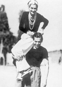
Indeed, it was Chanel’s intense dislike of this concept of ‘women-as-ornaments’ as much as her desire for practicality that provided the momentum for her easily elegant designs.  She was one of the

Chanel & Serge Lifar, Deauville, France -- 1937

first to unashamedly don trousers while on holiday — not because they seemed stylish, but because they were comfortable .  Her creations , along with those of contemporaries like Patou and Lanvin, ushered in a new era that trumped the bound and corseted shapes of the time to eventually become the de rigueur silhouette of the era.

Styles remained predominantly unchallenged over the next decade, with pants continuing to appear on the fringes of sport and society.  It was not until the advent of World War II and its repercussions that trousers finally began to appear in every woman’s wardrobe…


…CONTINUED NEXT WEEK

HUE CLUE — The Psychology of Color – Part II

24 Jan

“There is no model, there is only color.”
— Paul Cezanne

Our response to color is as unique as it is universal, as relevant to our cultural heritage as it is to our own very personal experiences.  Because it creates a mood, color can have a chameleonic effect to the viewer.  A man in a blue sweater tends to come across as easygoing and personable.  Change that color to red and that same individual will be viewed as more challenging, less friendly, even arrogant.  Yet we associate that same red with passion and sensuality.  A woman at a party in a black cocktail dress is seen as chic, urbane and slightly mysterious.  That same woman in a red dress is, to the same observer, perceived as more powerful, sensual and sexually desirable.

The most complex response we have to color, however, comes from our own personal experiences.  Since external stimuli have tremendous impact on our senses, this has nothing to do with what is sent down the runway.  Because color is so evocative to our psyche, we tend to relate specific tones or combinations of tones to an event or period in our past.  This, above all else, seems to irrevocably affect how we relate to certain colors, positively or negatively, for the rest of our lives.

I truly loathe the combination of black and light pink – and I know the reason why.

Before I began working in the fashion industry I was a theater and dance major and attended college to study both.  As a freshman I was required to study the fundamentals of ballet.  The classes were occupied by a number of young women – quite serious in their studies – who were always dressed the same way: black leotard with pale pink tights, or pale pink leotard with black tights, plus matching leg warmers and pink satin toe shoes.

These classes were also ridiculously overcrowded and lacked the proper supervision – consequently by the end of my first semester I had injured myself to the point that I had to withdraw from school entirely in order to recuperate.  To this day, any time I come upon black and light pink, I actually feel physical pain – a purely psychosomatic response, but one that will forever affect my perception of those colors.

I would love to know what colors you, the reader, are fond of or, conversely, which hues you find hideous – and more importantly, why??  (The fascinating thing is that, almost always, the combination of the two tones – the one you love and the one you hate, work off of each other beautifully.  Interesting, no?)

“I’m not that interested in fashion… When someone says that lime-green is the new black for this season, you just want to tell them to get a life.”
Bruce Oldfield

I’m actually very fond of these bright, pure tones for Spring/Summer 2011.  They have a clarity that transmits a certain vitality and energy, a hopefulness, that is much needed right now.  At the same time there is an audacity to these colors that, while appealing on the page, is likely to be difficult for many women to be comfortable interpreting.

In a volatile economy where consumers are especially cautious about purchases and consider every new garment an ‘investment piece’, it’s difficult to imagine a nearly-neon pink trouser or lemon yellow ankle-length halter jumpsuit a viable purchase.

These are pieces that can be frustratingly limited in their lifespan – recognizable garments that, because of their tonality, are particularly memorable the first time worn and are consequently difficult to integrate with one’s existing wardrobe or reinterpret to seem fresh and new.  This poses a problem to any individuals with a limited budget who, frankly, are the overwhelming majority of consumers.

This isn’t to say that you should keep it dark and somber all summer – it’s simply a question of what to invest in.  It’s important to remember that runway and reality are two very different things.  With this in mind, there are three basic factors to remember when investing in color for Spring/Summer: Quality, Shade, and Placement.

Quality is of utmost importance when working with bold hues – inexpensive synthetics and inferior workmanship are far more obvious in a bright color, where every stitch and seam is easier to see than in a dark or neutral.  Additionally, quality fabrics dye more richly than their substandard counterparts.  Wools and silks, particularly in gabardine or crepe, not only take color deeply but move beautifully on the body.

Shade is equally important.  Color can have a number of different values – in other words, it can be lighter or darker by adding either white or black.  For example, adding white to a pure yellow creates a pastel tint while adding black to that same yellow conjures a mustard shade.

In addition, most colors have subtle undertones to them that are either red, blue or yellow.  Hues with blue undertones will almost always be easier to wear than those with red or yellow in them.  This two-tone ensemble from Lanvin is a perfect example of two different shades of the same color.  The darker beet red of the skirt actually has more ‘blue’ in it than the brighter persimmon of the one-shoulder top, which has more ‘yellow’ in it.

It seems odd that red can also be blue or yellow, but in the study of color theory it’s actually very rare for a color seen in any visual medium – fashion, art, interior design – to be completely pure.

If you want to get an even better idea of this concept, pick up any paint company’s options for the color white – there are dozens of different ‘whites’ – some have blue undertones, some pink, some green.  These undertones are so very subtle when applied to a surface that they’re almost impossible to distinguish.  Yet, pure unadulterated white on a wall is surprisingly cold and uninviting – hence these options that soften this chilly color to something that is, almost subconsciously, far more appealing.

Placement, where on the body or in your ensemble you choose to employ bright color, is crucial.  Vibrant tones usually work best on the upper body — blouses, blazers, pullovers and knits instead of bright skirts and trousers.  Because when we stride the majority of our movement is from the waist down, a bright color in a bottom seems more blatant, less balanced, than that same color in the upper part of an ensemble.

This look from the Gucci runway is a wonderful example – together the blazer, top and pant are a bit overwhelming.  By replacing the teal green trouser with a black pant, the look immediately becomes more anchored, less gimmicky.  The warm citrus orange of the jacket is a fantastic way to update a wardrobe – there are so many ways to interpret it.  Imagine the blazer over a white tank and casual khaki trousers or a tailored camel skirt, or pair it with an simple espresso brown shirtdress.

For those who aren’t as committed to color for the coming season, employ shots of these wonderful hues in smaller ways that are both economically feasible and easier to incorporate into an existing wardrobe.  Small pops of bright in accessories – scarves, belts, shoes and bags – can update a look without breaking the bank, and have fantastic mix and match possibilities while still blending beautifully with the blacks, whites and neutrals that are already in most women’s closets.  Leather goods like bags, belts and shoes are particularly smart investments – if and when you tire of the color you can always have them dyed to a dark neutral.

This classic Dior bag, reinterpreted in color-blocking is a witty way to pull in this season’s craze for the colorful.  The specificity of the bag, however, means that after a season it may feel a bit ‘done’.  Any leather specialist that works with shoe repair can easily dye it navy or black — in essence giving its owner a new, utterly classic accessory for the following fall.

When working with powerful tones less is often more.  Anchoring a bright with a neutral lends elegance to what could otherwise be overwhelming.  Neutral and dark shades will always look more sophisticated, and bold tones from head-to-toe are something that few can pull off well.

Vibrant hues do require a certain amount of confidence, but working with them is hardly rocket science.  While it’s paramount to wear what feels comfortable to you, the challenge of trying something new often brings out aspects of your personal style and, perhaps the person underneath, that may otherwise not be discovered.

That, after all, is what style is all about…

Be well, all, and thanks for reading…

Chris

HUE CLUE — The Psychology of Color — Part I

10 Jan

“When in doubt, wear red…

– Bill Blass


There is certainly no lack of color for Spring/Summer 2011.  What is interesting, however, is that unlike past seasons, only clear intense tones were presented – nothing soft and understated, demure or subtle.  These colors possess a vigor that seem to be intent on provoking a particular response from the consumer – powerful tones that energize and strengthen, imbue a sense of positivity and hope that is much needed at the moment.

The psychology behind this energetic use of color is fascinating.  Physiologically human beings respond to color in both visual display and fashion faster and more strongly than any other aspect of design – line, shape, scale, texture or symmetry.

Yet the effect color has on us is as much genetic (red tends to excite more neuron activity in the brain, blue or green less so) as it is cultural (tonality plays a huge part in various religious and spiritual practices throughout the world – one society often views the same hue as having a completely different significance than their cultural counterpart).  For the most part, however, the human response to different colors is universal, and in turn generates the same unconscious reactions.

—–

In art and design, color is divided into three basic families:  Warm, Cool and Neutral.  Warm colors include reds, yellows and oranges.  Cool colors are comprised of blues, greens and violet/purples.  Neutrals are a sort of ‘non-color’ color family – clean, understated tones like white, black, beige, grey and brown.

Warm colors are energizing and engaging – they tend to make one feel lighter, happier, more expansive; reminding us of warmth, sunshine and the fire of passion.  Shades of red, orange and yellow do other, more unexpected things – they make us work harder, move faster and increase the appetite.

Walk into any major fast-food chain and look around – warm, bright color schemes abound.  This isn’t done so that you feel all happy and fuzzy when you enter.  It’s done to make your eyes bigger than your stomach and get you in and out as quickly as possible.  It’s difficult to sit in a noisy, brightly-lit space with red and yellow furnishings and have a relaxing meal.  But then, you aren’t supposed to – these colors are chosen not only to increase your appetite once you step in the door, they’re chosen to make you wolf your food down and get out of there as quickly as possible so that you clear a table for the next unsuspecting ‘Super-Sizer’ to sit down.

This is also why stop signs, traffic lights and fire trucks are red – they’re designed to catch your attention and evoke an immediate and impulsive reaction.  Imagine a stop sign in a pale blue or a fire engine the color of an Easter egg – not very evocative, is it?

Cool colors have the opposite effect – they tend to mellow and calm, evoking images of blue skies, green grass, calm seas and spring-like days.  It’s not surprising that the overwhelming majority of people questioned state blue as their favorite color – its soothing, meditative properties tend to make both situations and individuals more approachable and less threatening.  Blue is often used in clinical, therapeutic and medical settings as it has the benefit of calming patients subconsciously.  Stylistically it’s often a choice made to engender oneself to others.

One must be cautions with blues, though – the wrong shade of blue can easily feel cold, moody and aloof.  Remember — no one has ever claimed to have ‘the pinks’, but an entire musical genre is dedicated to singing ‘the blues’.

Neutral colors can also be tricky to work with, and depending on the tonality, can be anything from rich and sophisticated to chilly and antiseptic.  A crisp white shirt is a symbol of classic style, whereas in design settings it can be quite sterile.  Hospitals are predominantly white for this very reason – it’s not just to make it easier to wash the blood off the walls (kidding) –  it’s to give you, the visitor or patient, the unconscious impression that everything is as clean and safe as possible.

We gravitate towards black in our wardrobe so consistently not simply for the fact that it’s classic and flattering, but because in many ways it’s the sartorial equivalent of armor – black is not only easy to mix with and difficult to get dirty, it transmits the impression that the wearer is confident, bold and sophisticated.  This in turn makes the viewer see the wearer as someone who is both formidable and desirable.

Interestingly, it was not until 1926 when Chanel introduced her first ‘little black dress’ for evening that black ceased to be a color worn only for mourning the dead, but an acceptable shade to be donned by the fashionable mainstream for any time or occasion.

Greys, beiges and browns can be murky and uninviting but when done correctly, are utterly stunning.  Worn together, beige and black is a timeless mainstay of many wardrobes.  Dark greys and browns are the perfect foil for otherwise too-bright tones — some of the most striking tonal combinations are espresso brown with bright fuchsia or emerald green; steel grey with scarlet or cobalt blue.

—–

As universal as our response to color is, there are two other diverse aspects of tonal psychology that must be taken into consideration – the breadth of world culture and the uniqueness of individual experience.  In essence, it is a question of nature versus nurture.

Culturally, how we perceive certain colors is dependent on our location geographically.  White in western cultures is seen as something pure, untarnished, virginal.  Because this allusion to the chasteness of white is so powerful it has, since the 1820s, been the only acceptable color for a bride to wear for her wedding ceremony.

In many Asian cultures, however, white is symbolic of death and the color of mourning.  It would be unheard of for a bride in many Eastern religions to wear white for her wedding – where instead she dons scarlet red – a color that is felt to bring luck, fortune and fertility.  (Imagine the reaction in the United States if a bride glided down the aisle in a bright red taffeta dress and veil.)

In Eastern religions orange is a color that represents a healing calm and enlightenment – hence the garb of Buddhist monks.  As evidenced earlier, western culture hardly finds this color relaxing.

In ancient Rome purple was a symbol of the hierarchy of the senate.  Any individual who was not a member of the senate was prohibited to wear the color upon penalty of death.

This propensity for purple later found its way into many Christian religions, where garments in that hue are reserved for only the highest of holy holidays.

——

In Part II next week I’ll cover the more personal aspects color on the subconscious, and delve into how to wear these new and powerful colors for Spring/Summer 2011

Be well, all – and thank you for reading

Chris


Resolutions…

1 Jan

This is about as esoteric and off the subject of fashion as I will ever get on this site, and I promise next week we’ll be back on target.  However, I keep coming across all of these media stories about New Year’s resolutions and how to keep them, and it’s both fascinating and disturbing.

The psychology behind a New Year’s resolution is puzzling.  We initially make this resolution with steadfastness and often-grim determination because, let’s face it, it’s usually a promise about something we really don’t want to do in the first place, or is challenging for us to keep up for a long period of time.  If it weren’t so difficult, we’d already be doing it, no?

So, of course, two or three months into the new year you’ve lost a fair amount of enthusiasm about this new, very trying resolution, and before the year is halfway through you’ve given up on it, and you’re frustrated and disappointed in yourself because of it.  It all seems very self-destructive — rather like cutting off your foot right before a marathon – you’ve set yourself up to fail (or at least be in a lot of pain).

Why not establish a ‘life resolution’?  Something basic that you desire to do that will improve yourself or humanity?  Something that you consistently strive to accomplish every day in your life, and re-address every year?  There’s no expiration date, no frustrating time constraint, no deadline that you’re almost guaranteed to miss.

My life resolutions are pretty much the same every year:

Treat others as you wish to be treated.

Remember that what goes around comes around.

Be open to new possibilities and ways of thinking.

Be as true to yourself and what you believe in as you possibly can.

Care for yourself – if you don’t you’re no good to anyone else.

Have faith in the innate goodness of humankind.

Know that everything happens for a reason.


So, when I start getting wrapped up in artificiality and unrealistic expectations — when the world tries to convince me that it’s imperative to keep up with the Kardashians, or make sure my toothpaste is sexy enough, or attempts to frighten me with commercials that spend 30 seconds of their one minute explaining the potentially fatal side effects of their amazing new drug, I remind myself of the above.

And, to clarify – just because I use these as my life resolutions doesn’t mean I don’t have bad days where I forget one or all of them, that I walk through life with unwavering confidence or, for that matter, that I only watch PBS.

I have plenty of lousy days where I’d just as soon stay in bed, question myself constantly, and without apology watch “Wipeout” and “Dancing with the Stars” every week.  I just thought I’d share this with you in the hopes that you get something out of it that makes your 2011 just that much better.

HAPPY NEW YEAR, EVERYONE